Mosaic · Launched October 22, 2012
A photobook designed to be finished in five minutes
I led Mosaic's design across the mobile app, identity, physical book, packaging, manufacturing, and launch. Someone could turn 20 photos into a finished book in about five minutes, without learning an editor or making dozens of layout decisions.
- Role
- Director of Design
- Scope
- App, identity, book, packaging, manufacturing, and launch
- Team
- Seven people
- Creation time
- Roughly five minutes
Origin
A new product, not a smaller version of Mixbook
Mixbook acquired our small team to rethink photobooks for mobile. Porting Mixbook would have brought years of desktop controls onto a phone. We started with a different question: what would someone actually finish on a phone?
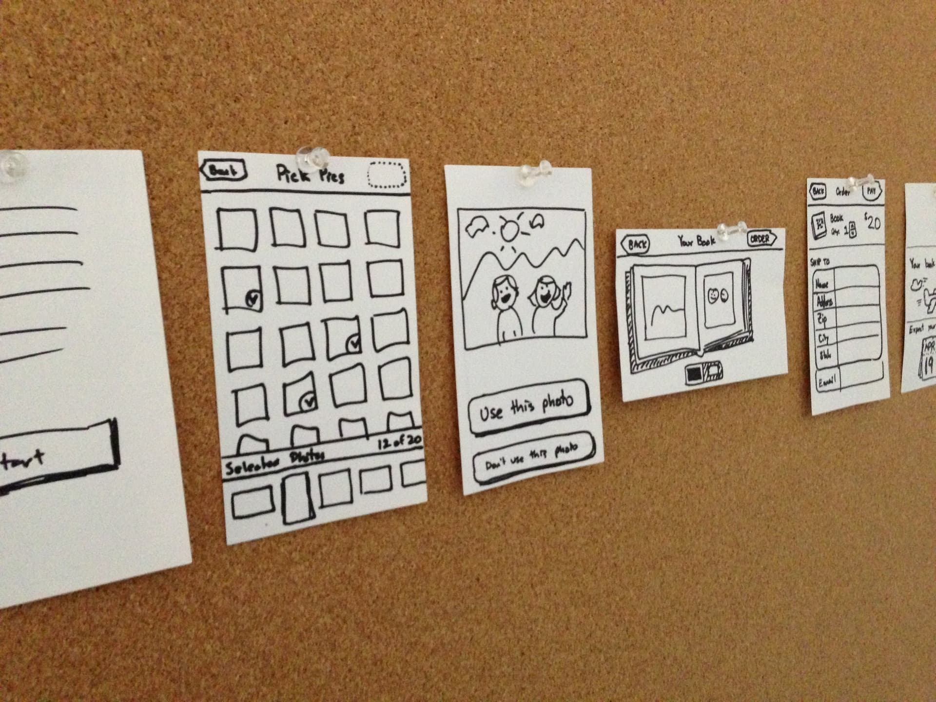
The seven-person team worked in one room. Product, design, and engineering decisions happened together, often around a rough prototype or a set of paper screens. I was the sole designer, working across every part of the experience.
Constraint
The whole product fit into three numbers
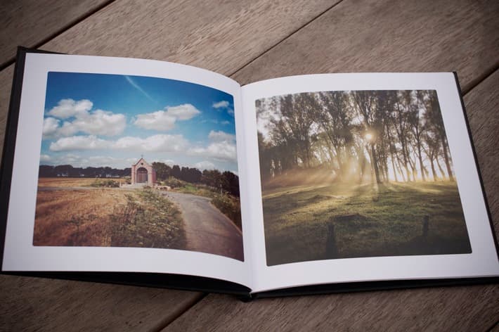
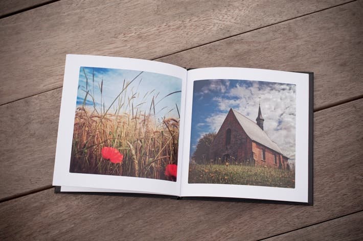
A Mosaic always contained 20 photos, one on each page. The only visual choice was a white or black background. There were no templates, stickers, title pages, or layout tools. The book cost $20 before tax and shipping.
That fixed format changed the job from designing an editor to designing momentum. In observed use, someone with photos ready could make a finished book in about five minutes.
20
photos
20
dollars
5
minutes
Creation flow
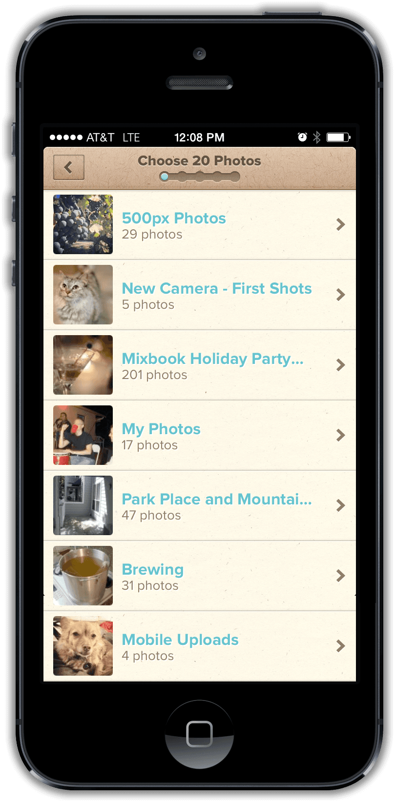
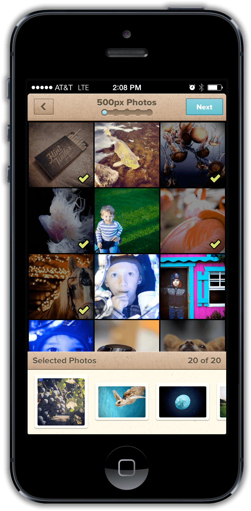
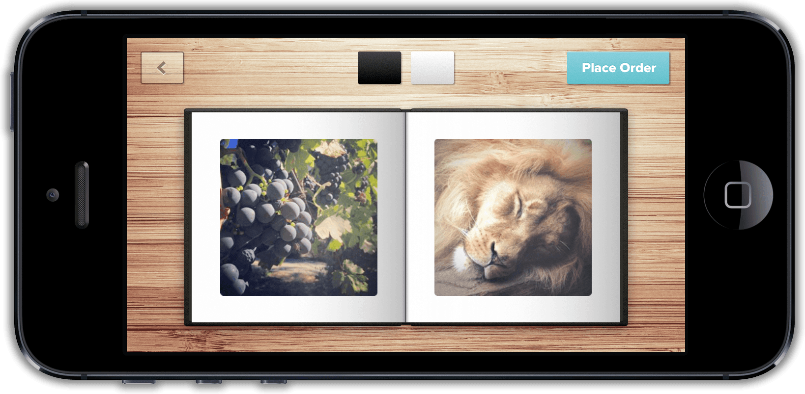
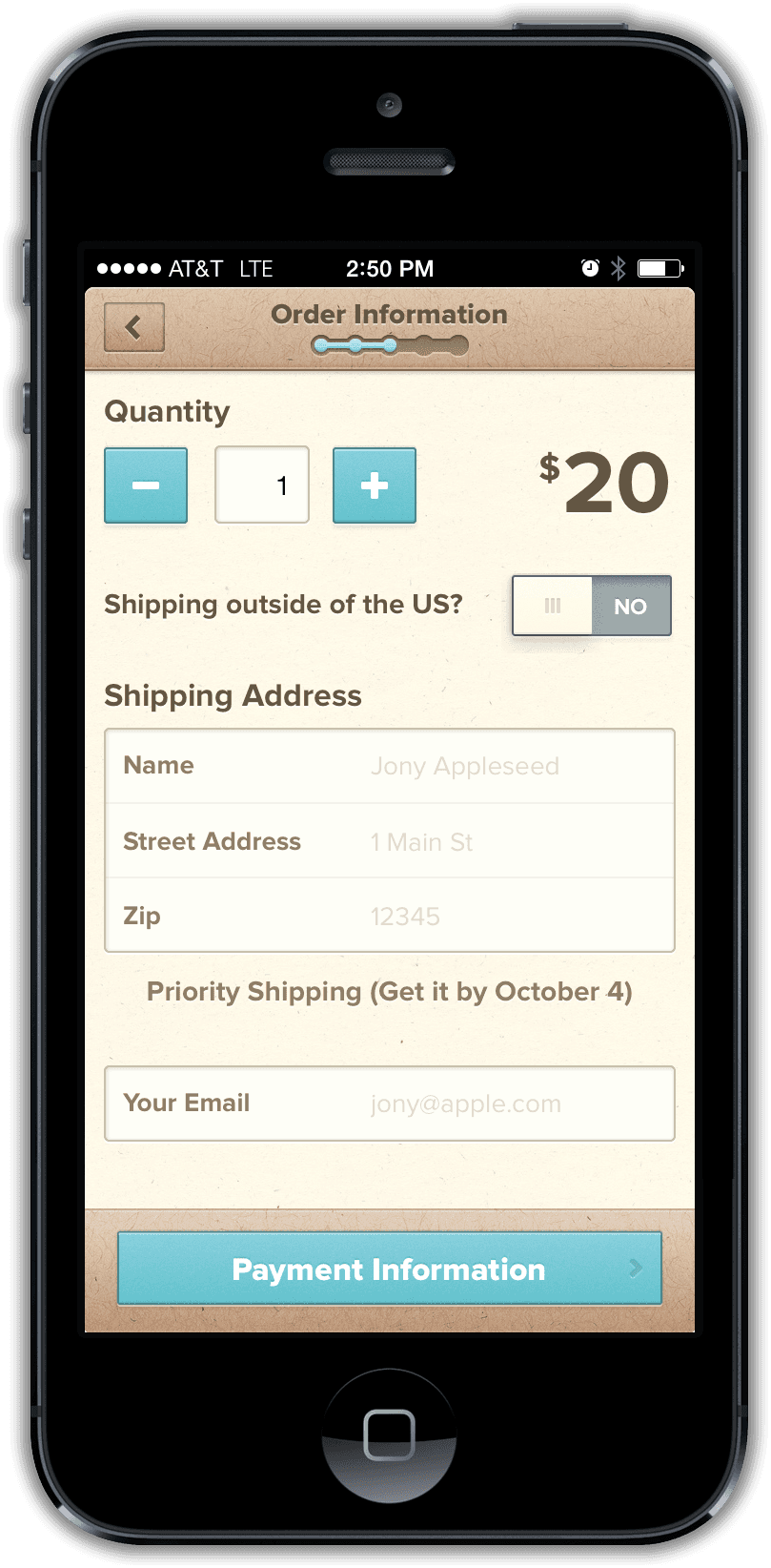
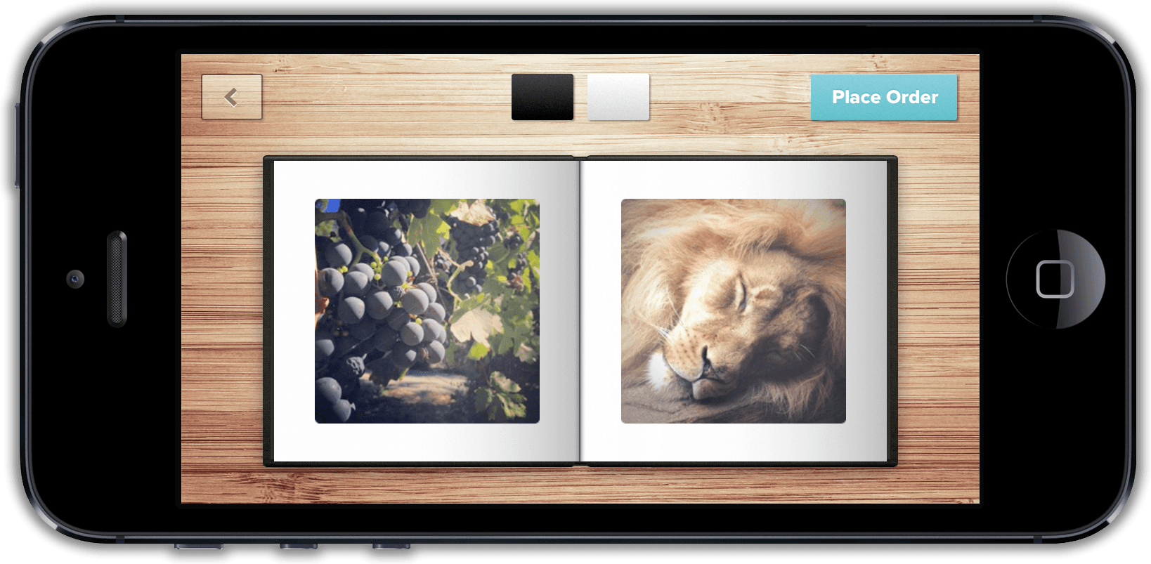
Choose the photos, preview the book, and order it
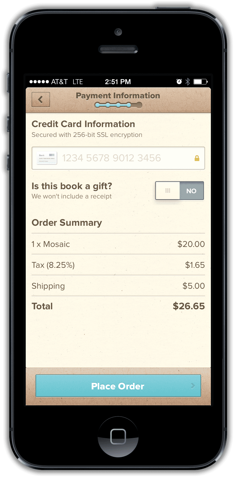
The opening flow moved directly from the camera roll to a swipeable preview of the physical book. Checkout asked for as little information as possible. We pushed our payment provider to accept only a ZIP code rather than a full billing address. It meant accepting more chargeback risk, but made buying a book easier for the customer.
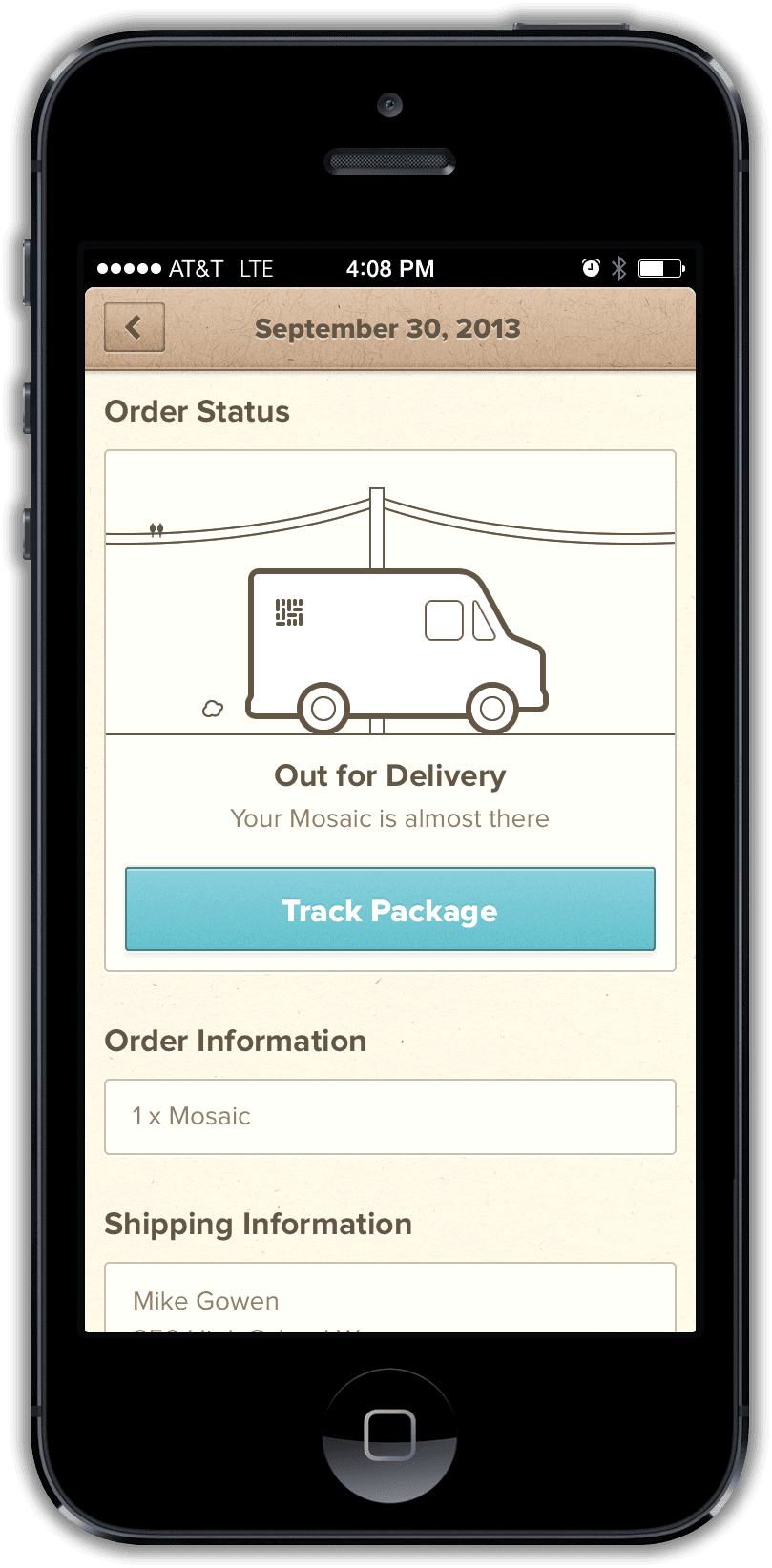
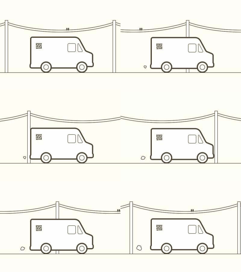
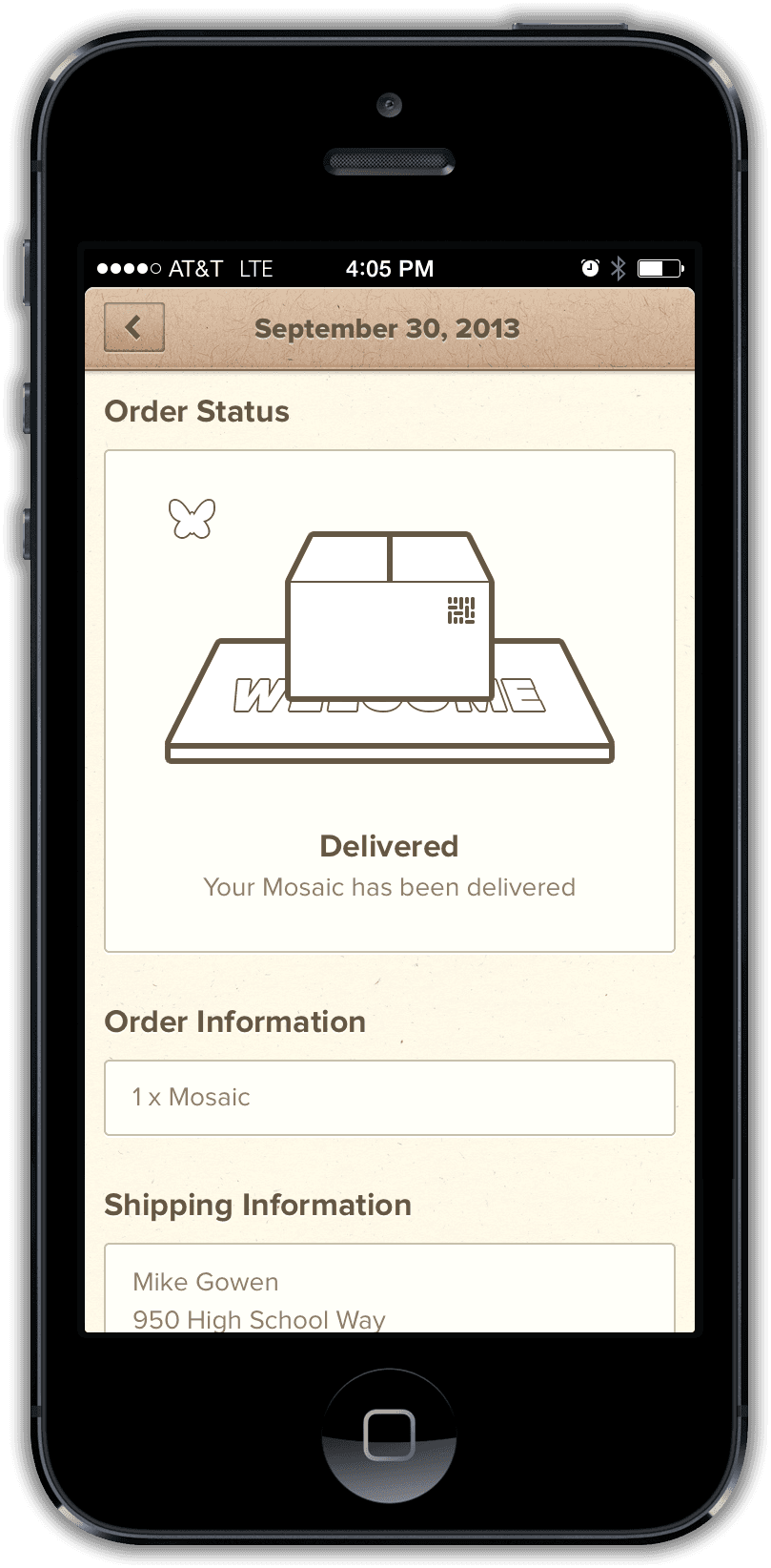
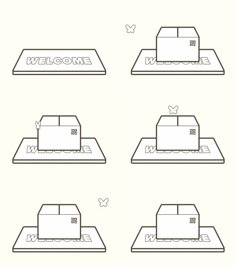
Follow the order to the door
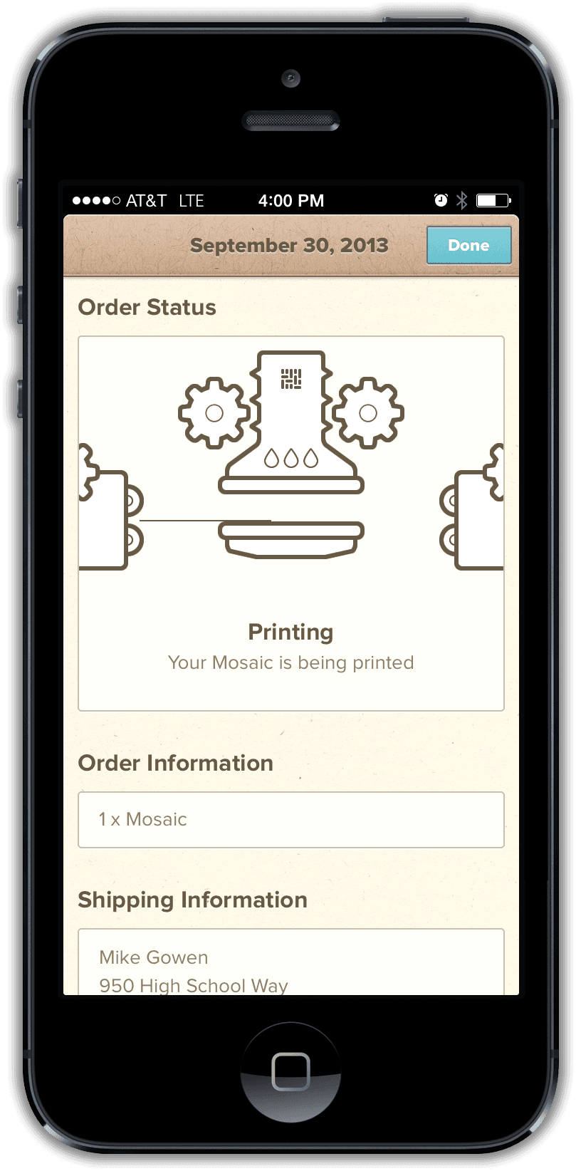
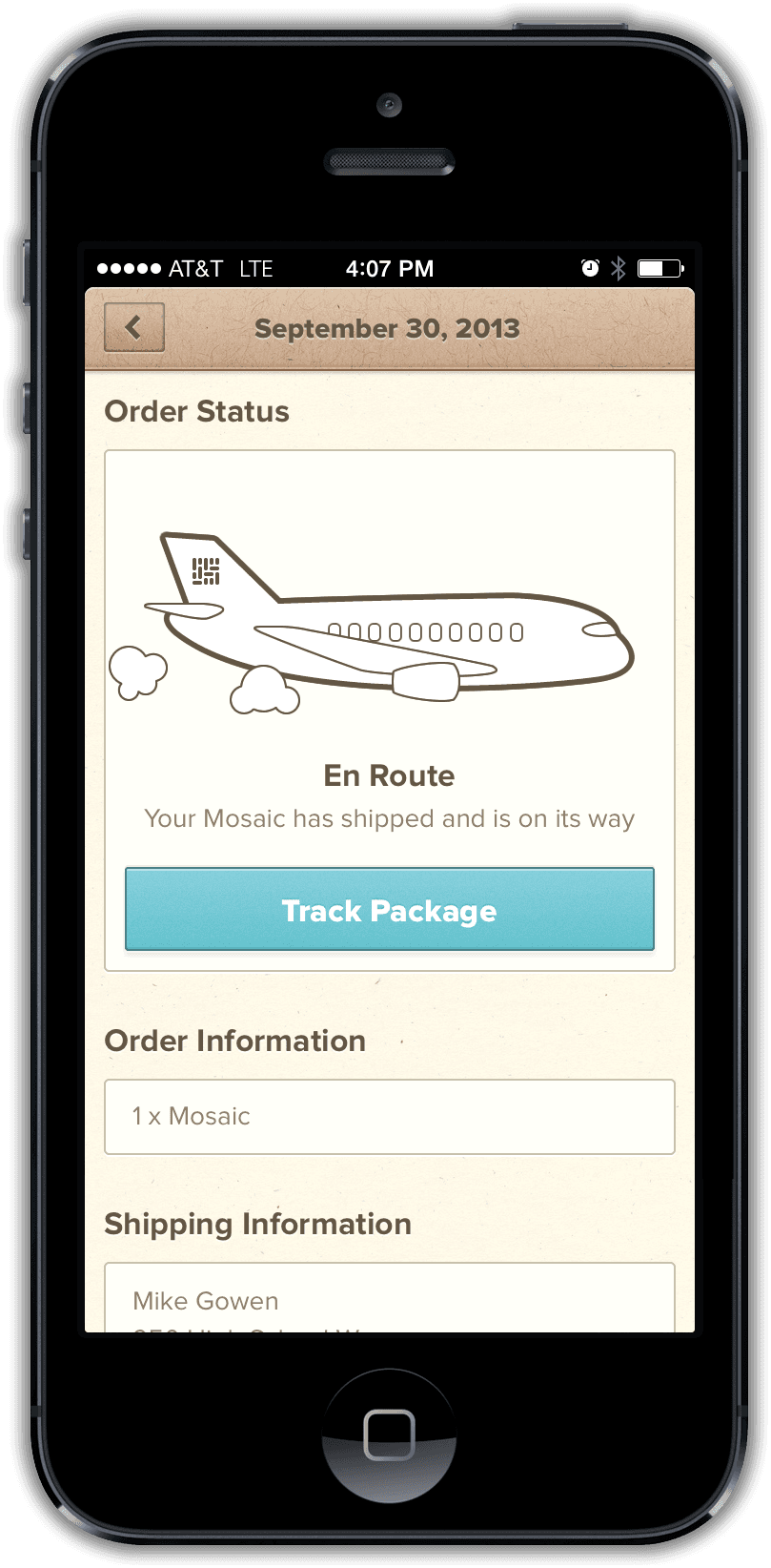
Printing, travel, local delivery, and arrival stayed visible inside the app and through notifications. Placing the order was another step in the flow, not the end of it.

Invisible complexity
Removing decisions moved the work into the system
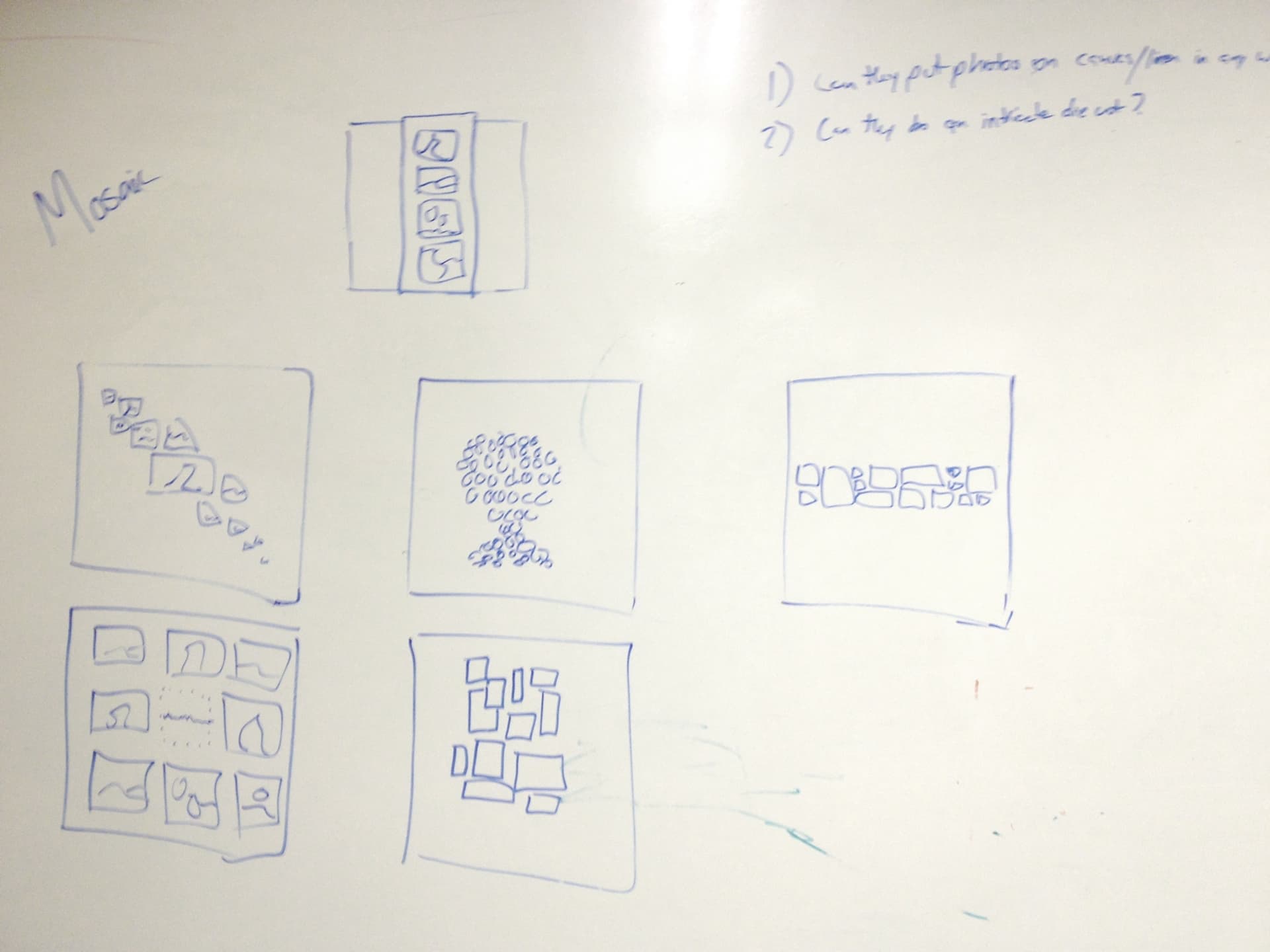
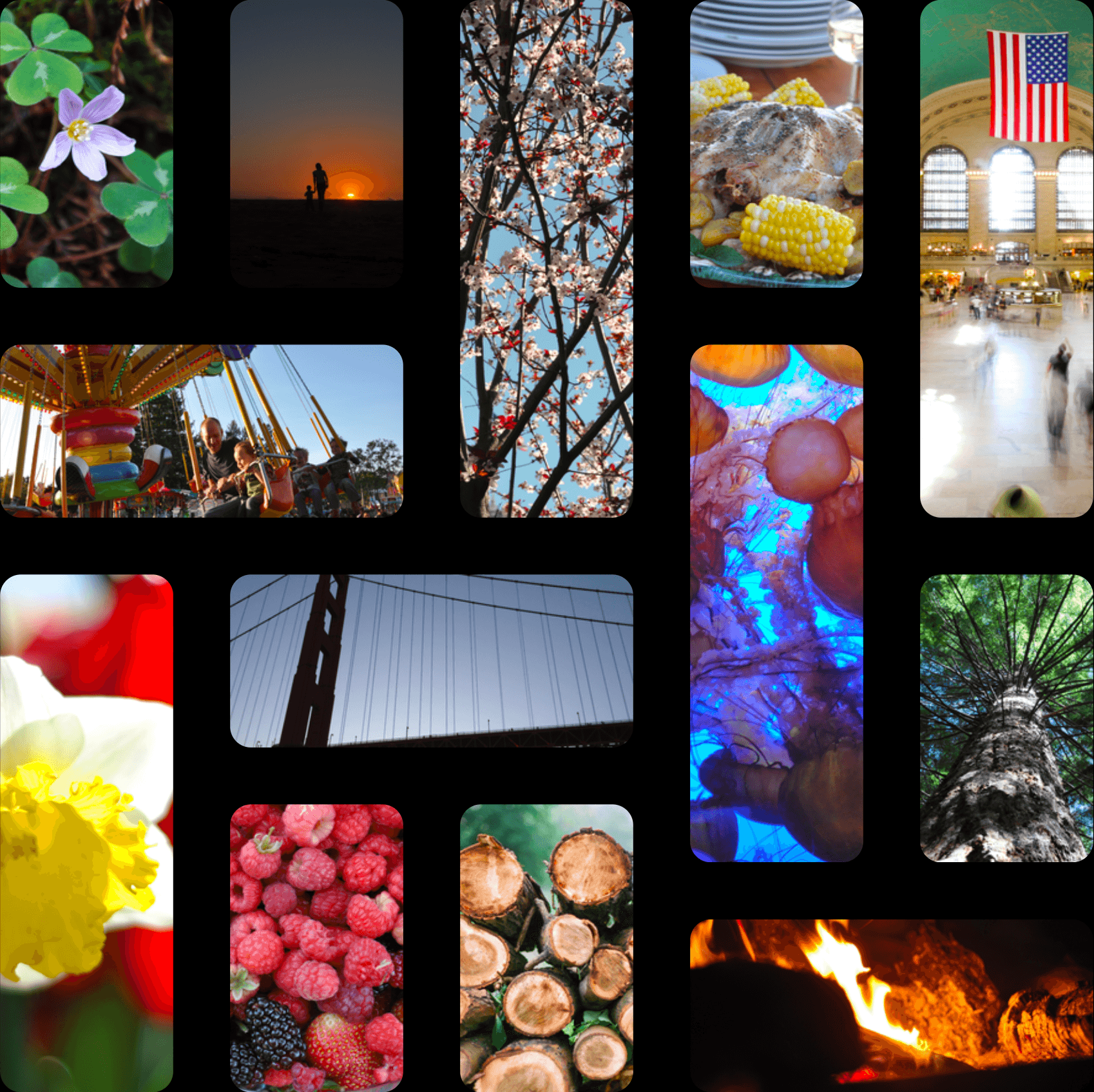
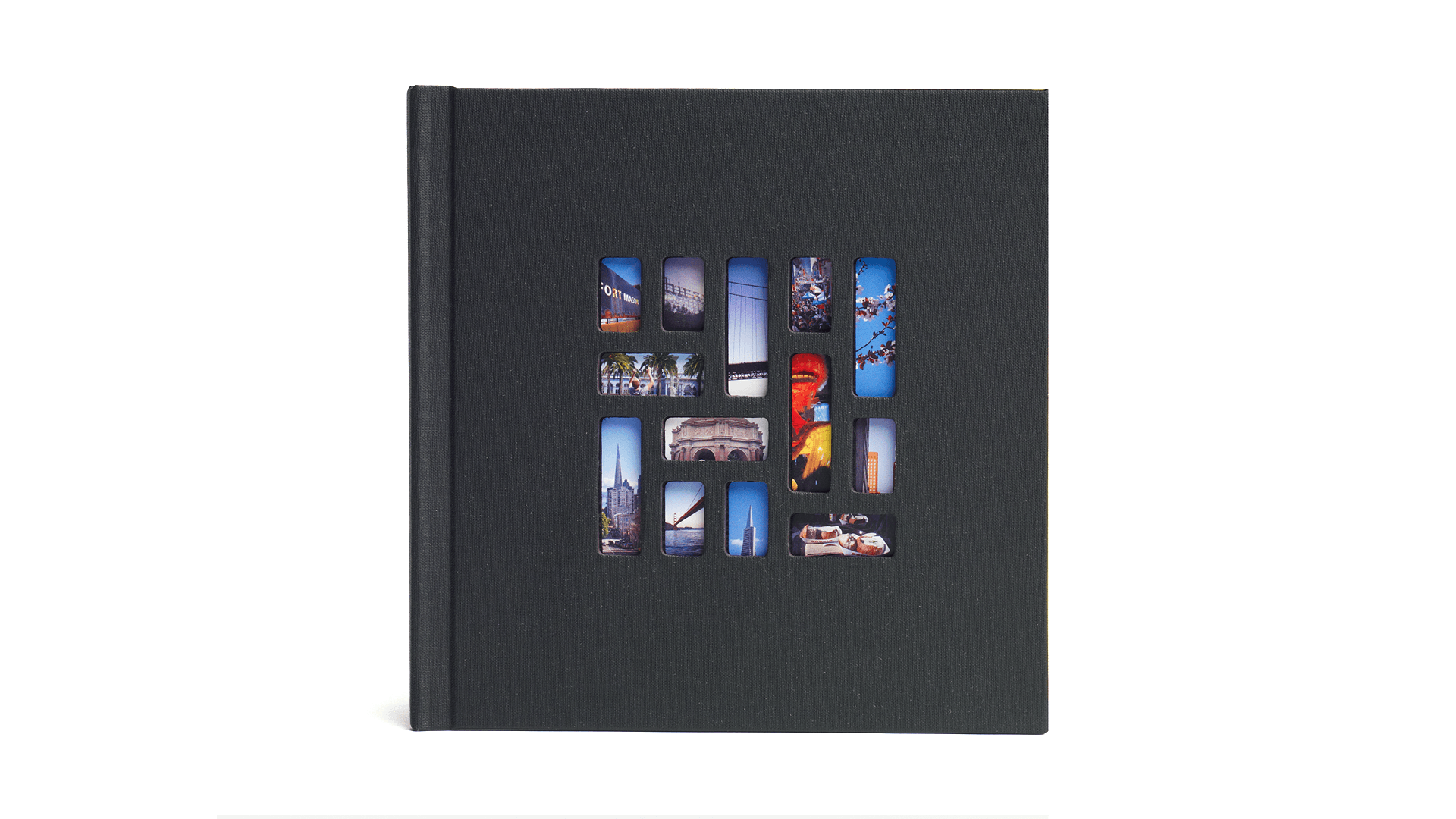
The cover's windows made the first photographs part of the object. Behind that simple effect, an algorithm selected portrait or landscape images and used basic face and subject detection to keep meaningful content inside the openings.
The same principle shaped the rest of the product. People should not have to manage layout, crop every image, or understand the production system. The software made those decisions so they could stay focused on the photographs.
You chose
20 photos
Black or white pages
Mosaic handled
Portrait or landscape
Subject-aware crops
Cover composition
One image per page
Product judgment
Add the capability without rebuilding the editor
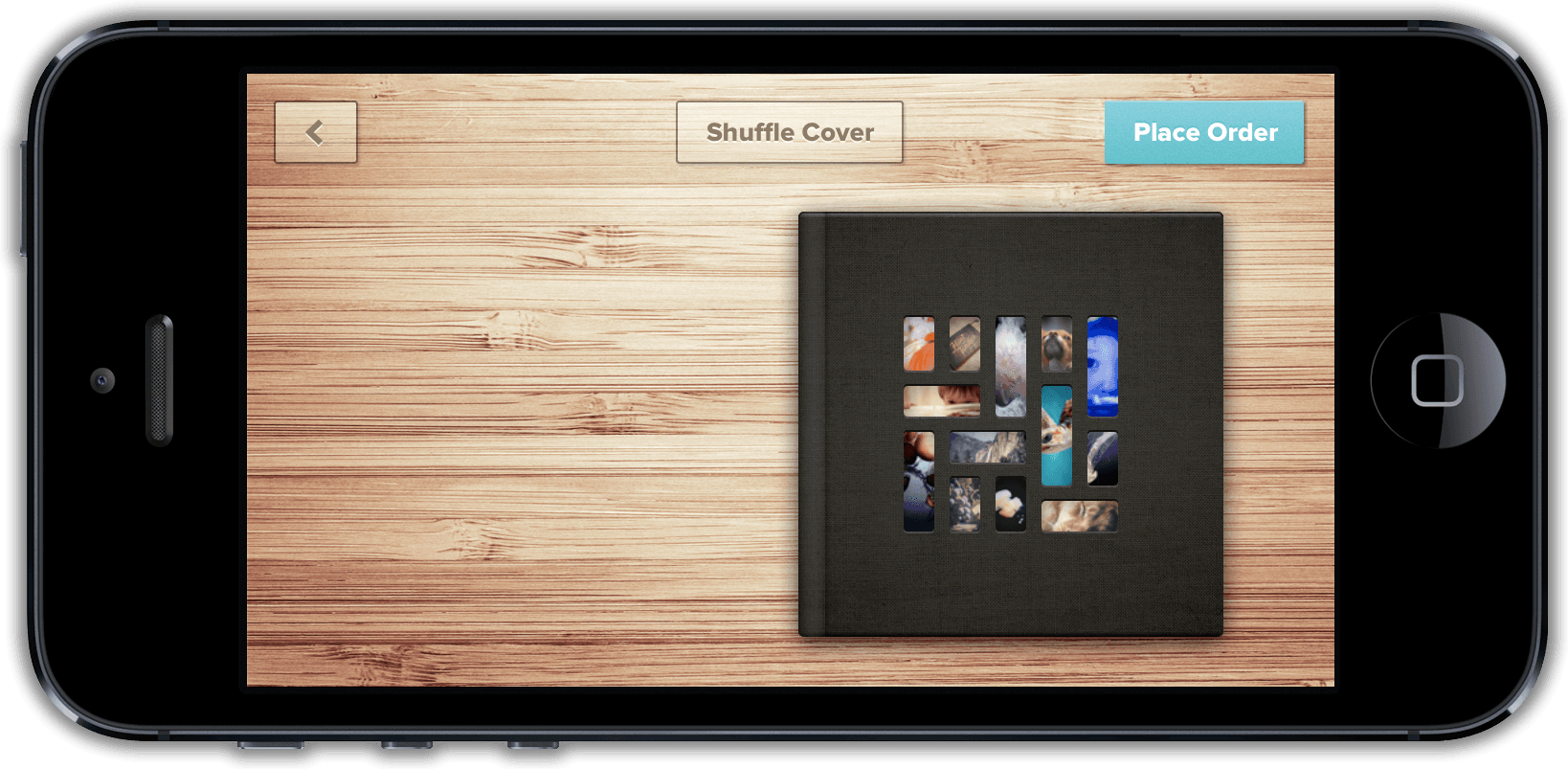
People wanted more control over the cover photos, but we pushed back whenever an added control threatened to turn Mosaic into the editor we had deliberately avoided. Page order already followed the sequence in which photos were selected, so it did not need a separate rearrangement interface.
Shuffle addressed the cover without turning the preview into an editor. Each press tried a new arrangement of selected photos behind the die cuts while leaving the page order unchanged. Captions followed later, after repeated feedback showed that the capability had earned its place.
Physical product
The app, book, and package were designed as one experience
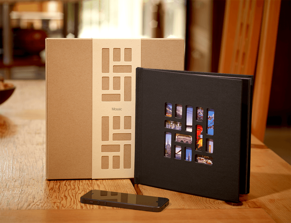
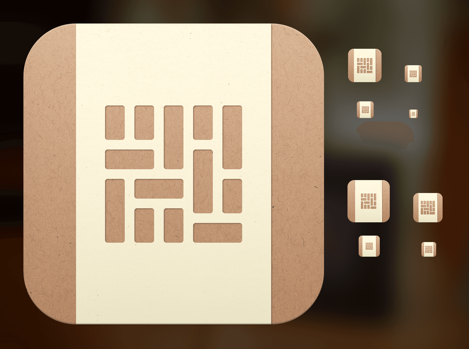
The app borrowed its textures, proportions, color, and movement from the book and packaging. I designed the identity, iOS icons, physical book, box, sleeve, ribbon, printed card, and every interface around the same small set of materials.
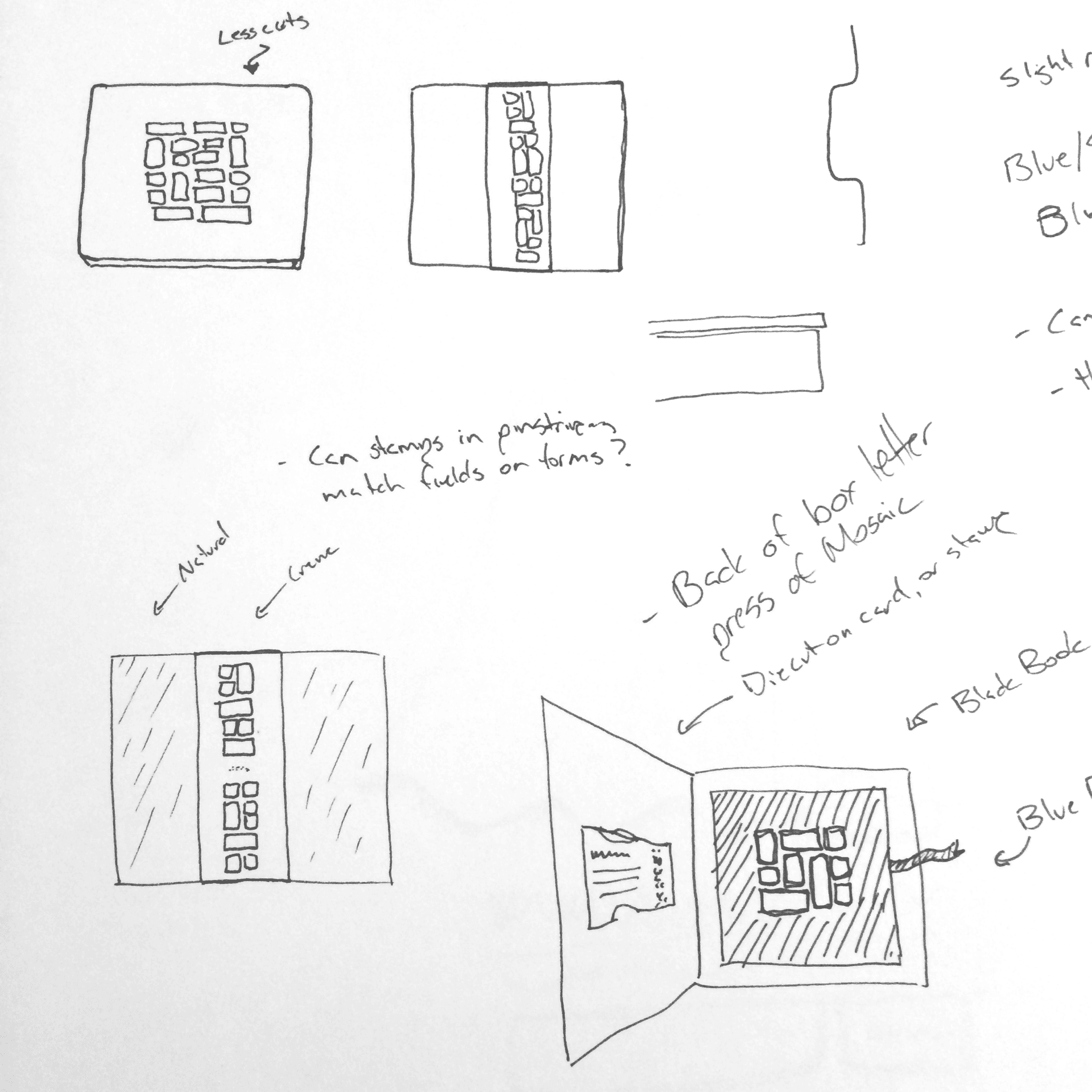
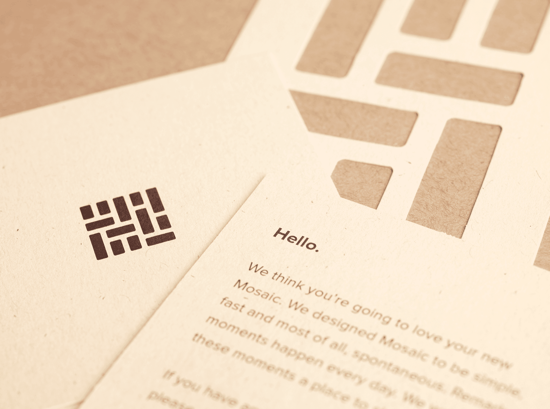
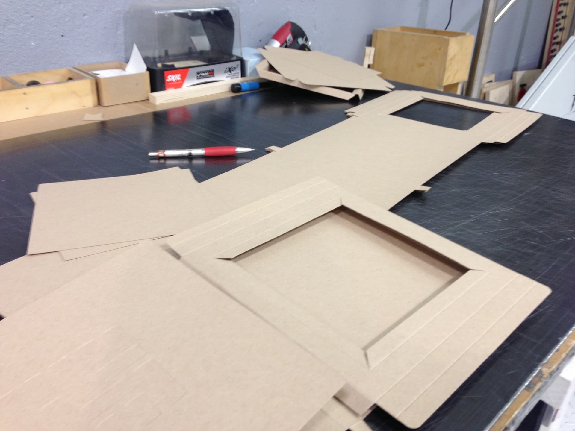
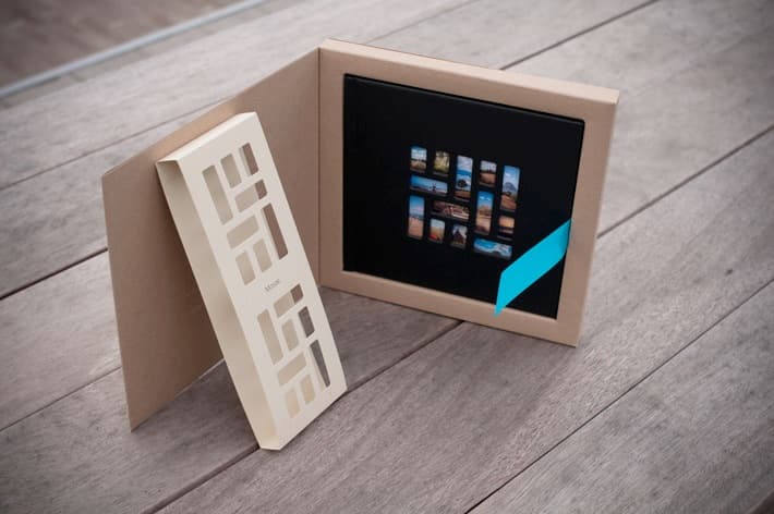
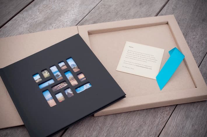
The package opened in stages: a die-cut band, a flip-top box, a book seated inside, and a blue ribbon that made lifting it out feel considered. Nothing was treated as secondary once the order left the phone.
Book design
The physical book
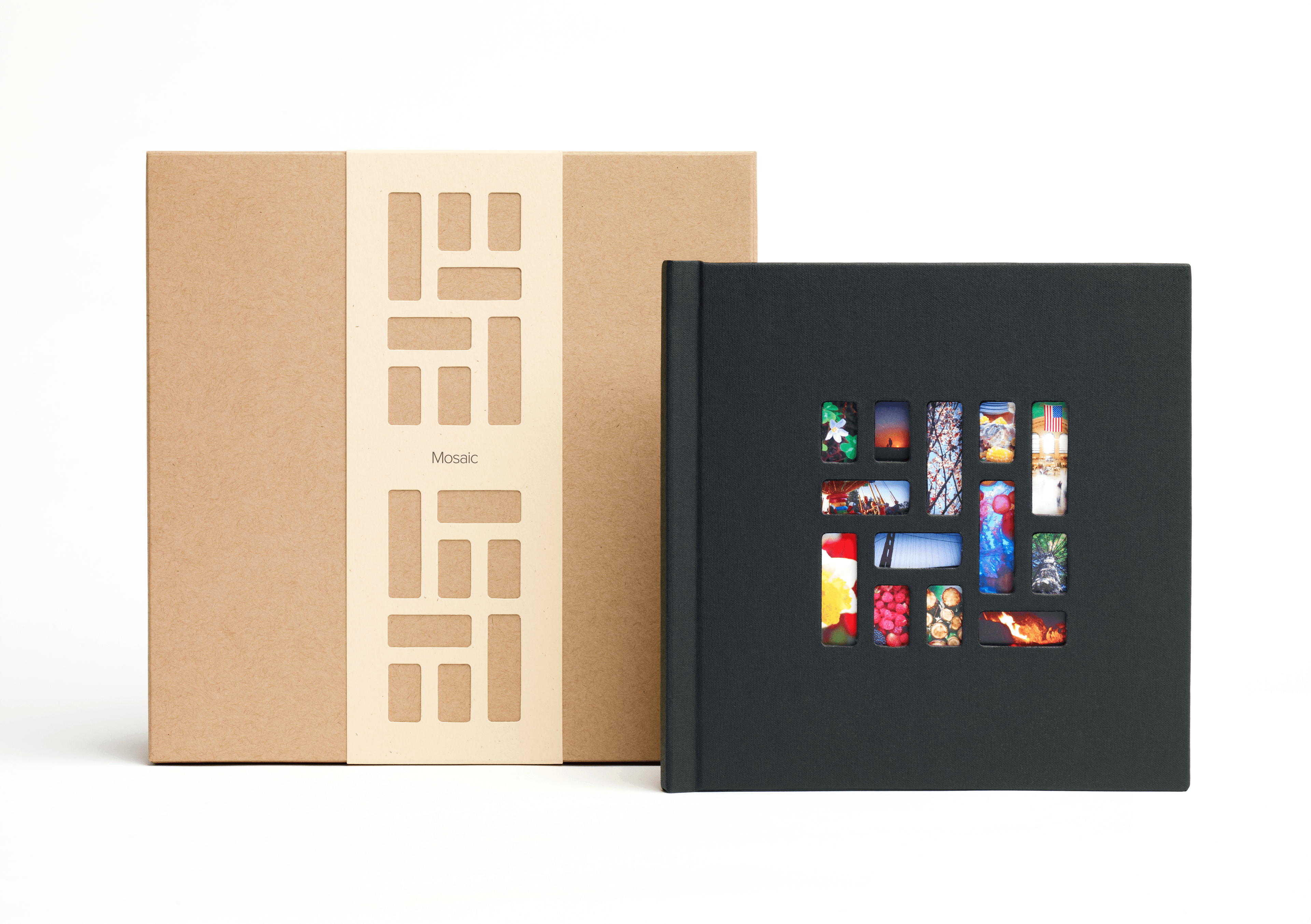
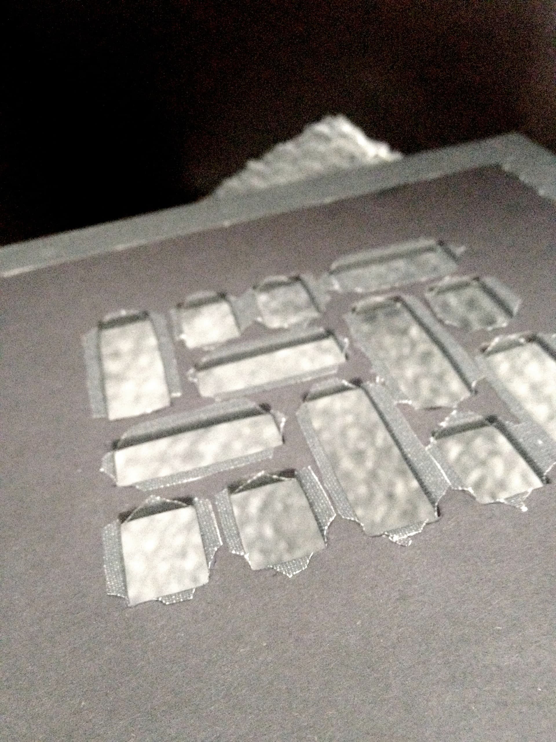
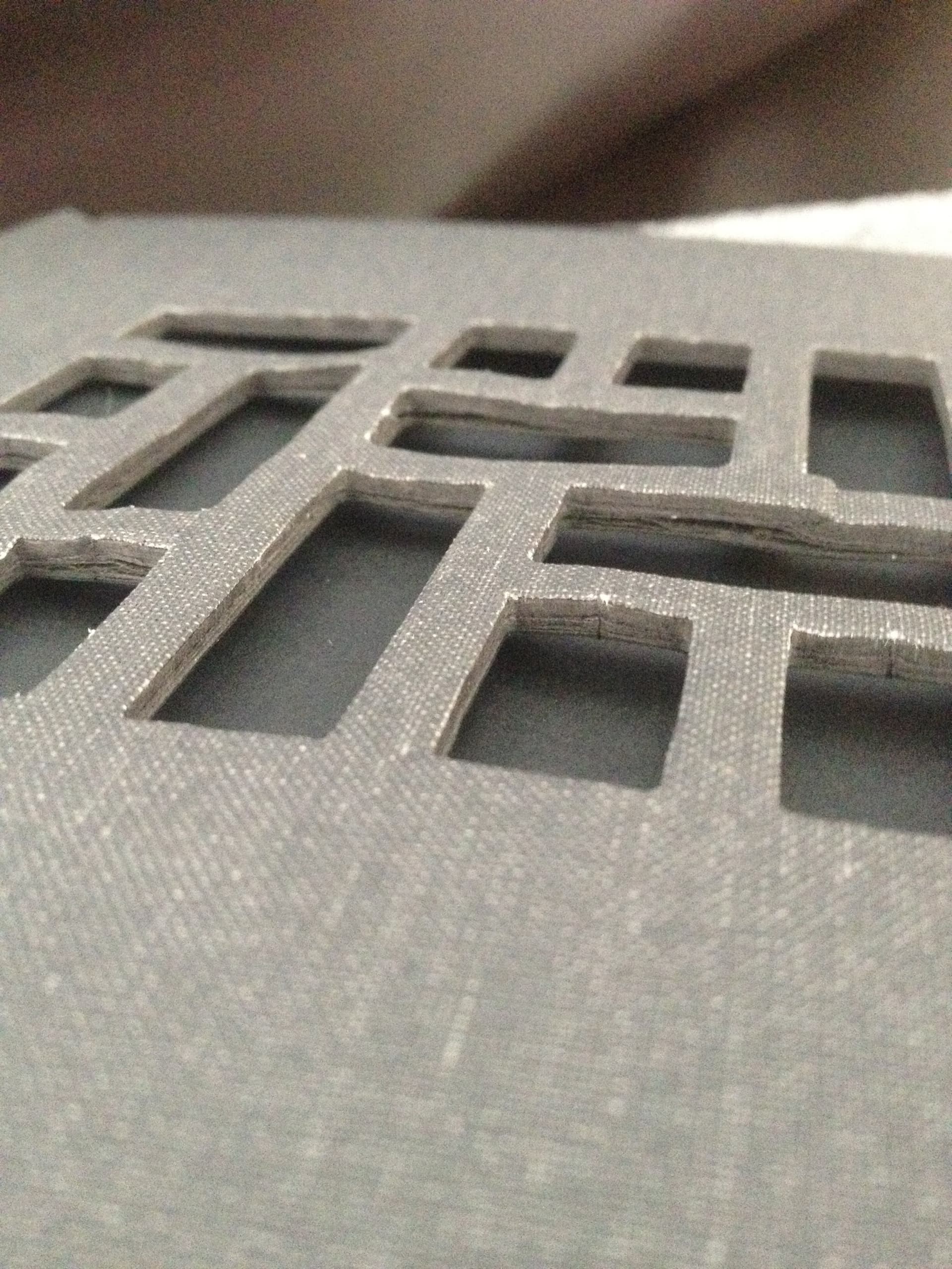
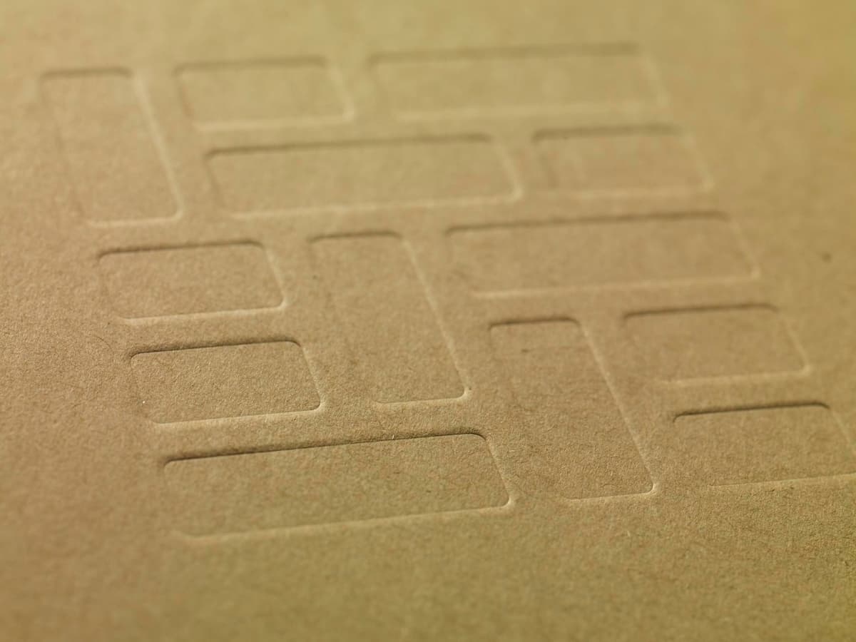
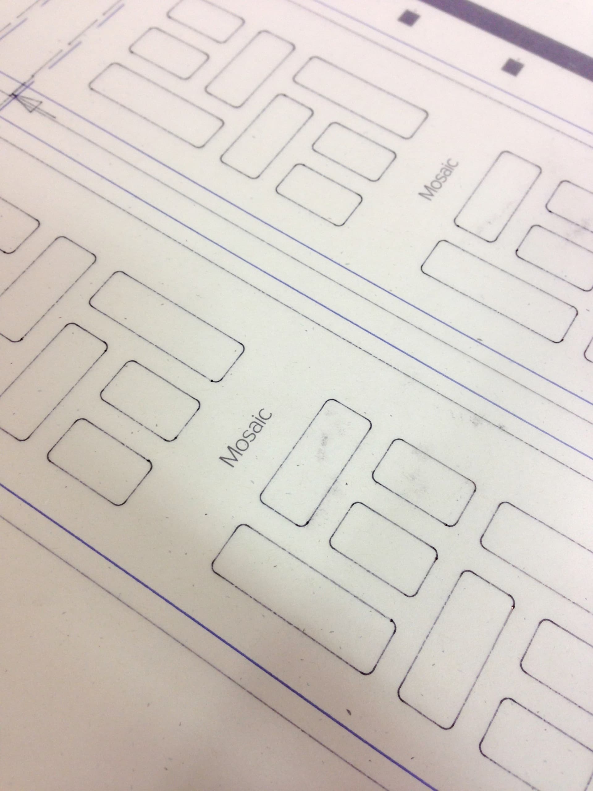
The book had to feel as simple and resolved as the app. I designed the die-cut cover so the photographs became part of the object, then worked with the team to choose every paper and material.
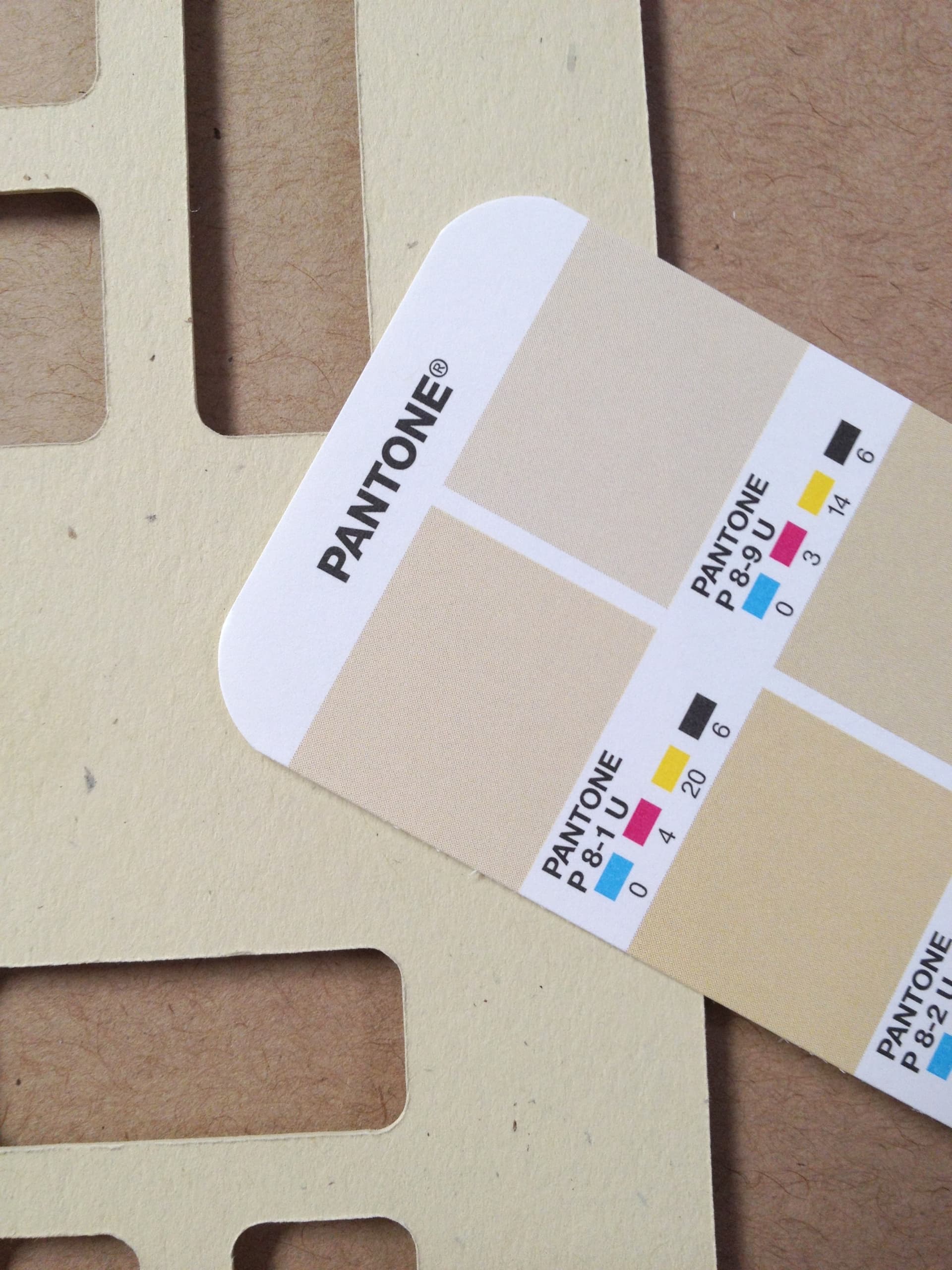
Making that cover reliably was difficult. We tested multiple constructions and vendors, using torn edges, exposed layers, and warping as evidence of where the visual idea and manufacturing process disagreed. At launch, we stayed close to production and quality control until the finished object lived up to the interface that created it.
Package design
The packaging
Fulfillment
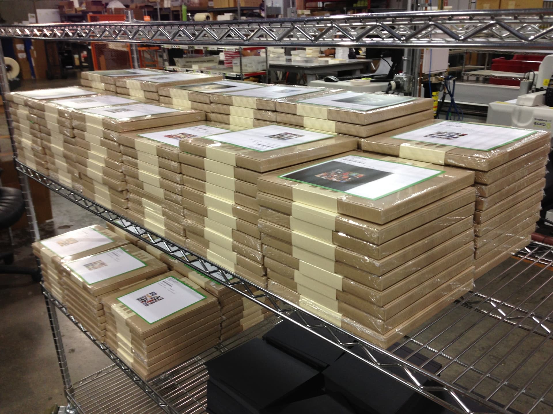
Printed within 24 hours and sent by two-day air
Books usually arrived around four days after ordering. That speed was part of the product promise, keeping the act of making a book on a phone connected to the moment it became a physical object.
At launch, we stayed close to production and quality control as orders moved from print to packing. Fast turnaround only mattered if every book still arrived as the object the app had promised.
Teaser
The anticipation started before the app was available
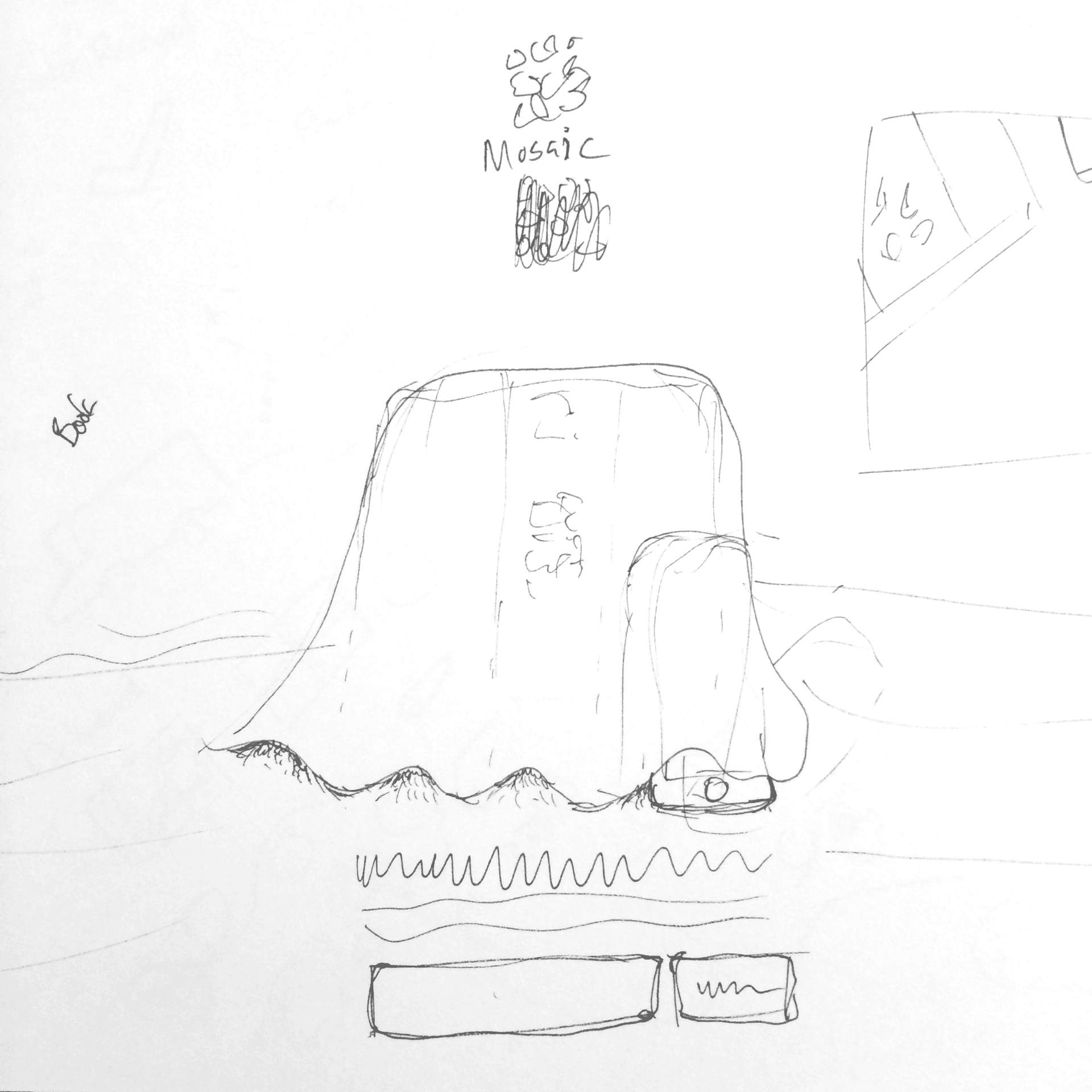
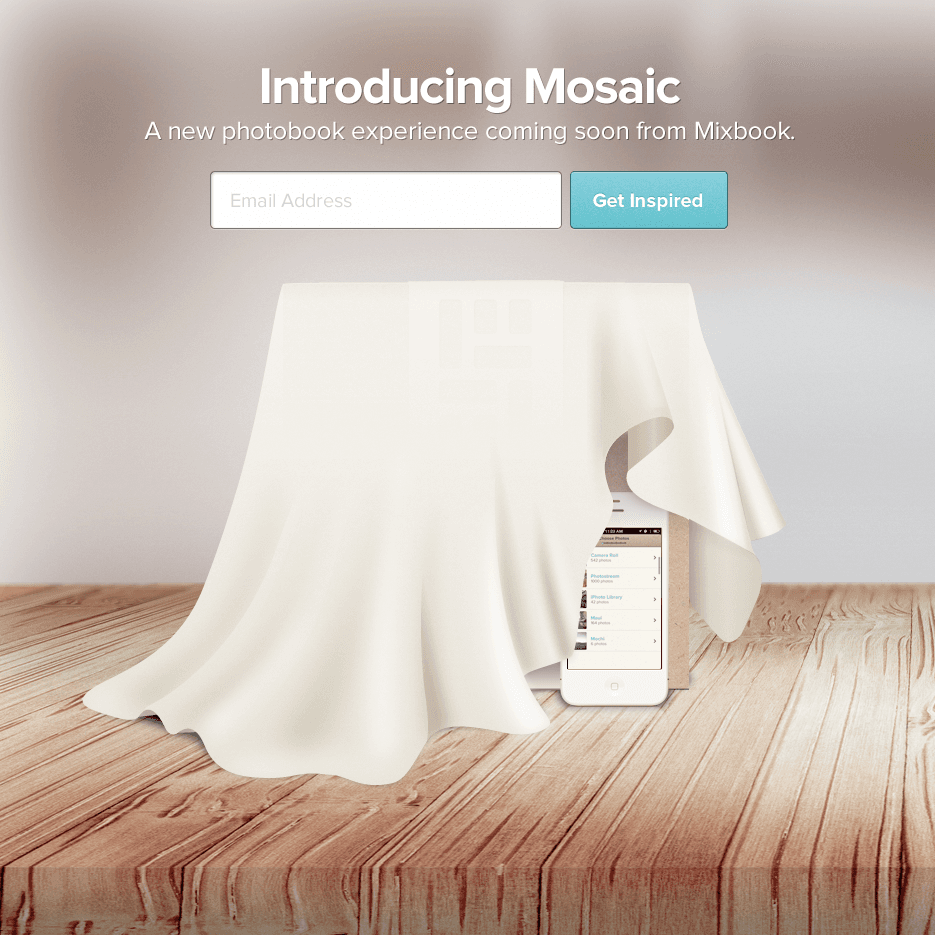
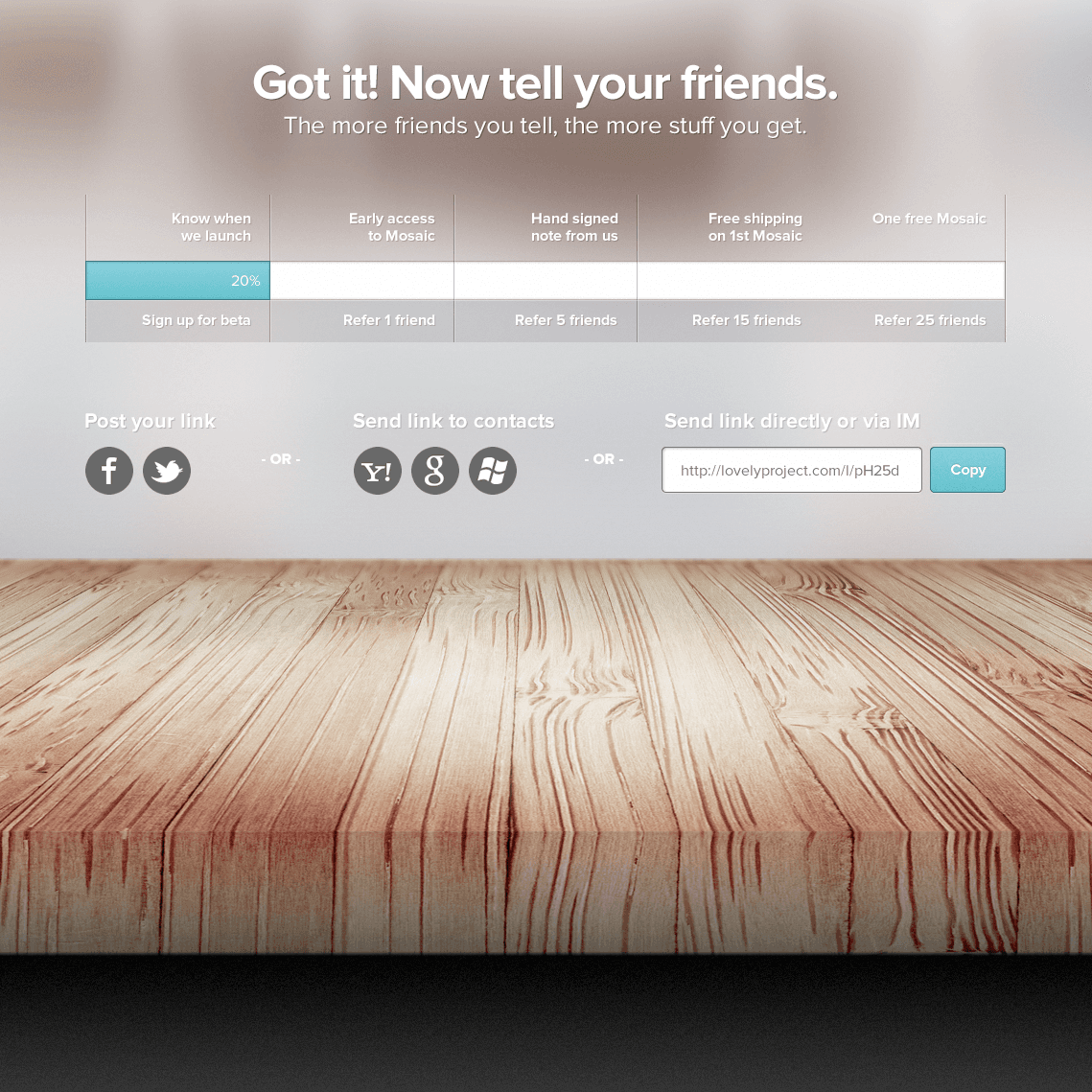
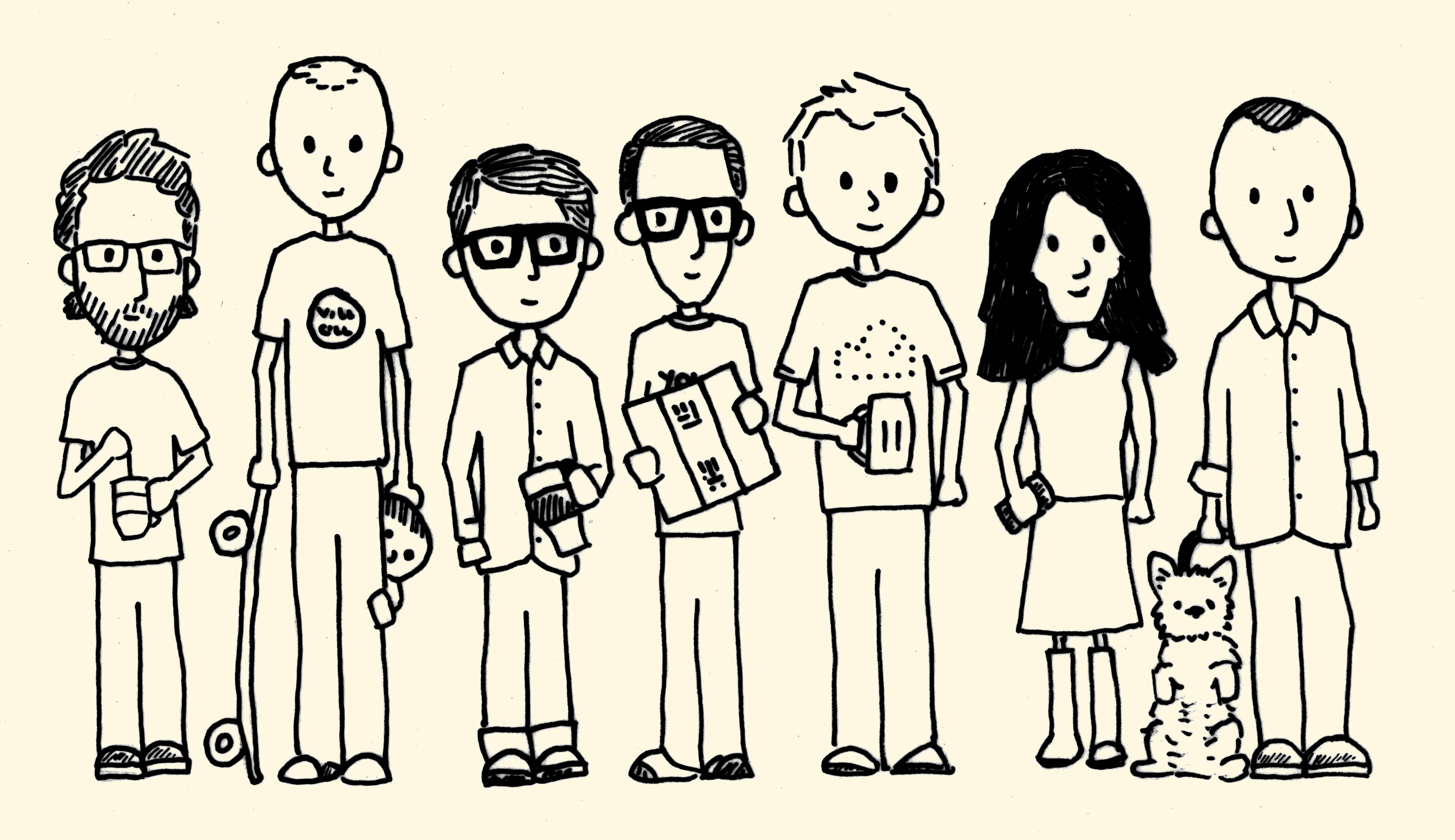
I designed the teaser site and referral system before the app was available. The waitlist rewarded referrals with a hand-signed thank-you card featuring the team, turning early interest into a small object from the product's world.
Launch
The launch showed the complete experience
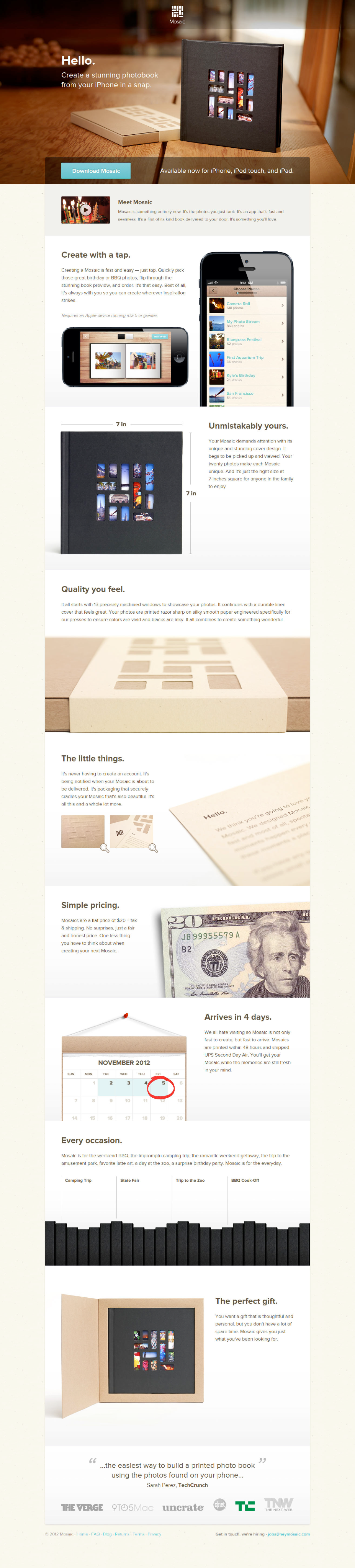
I designed the launch campaign, App Store materials, illustrated cards, and photography direction. The campaign presented the app and physical product as one continuous experience, from choosing the photographs to opening the package.
Reception
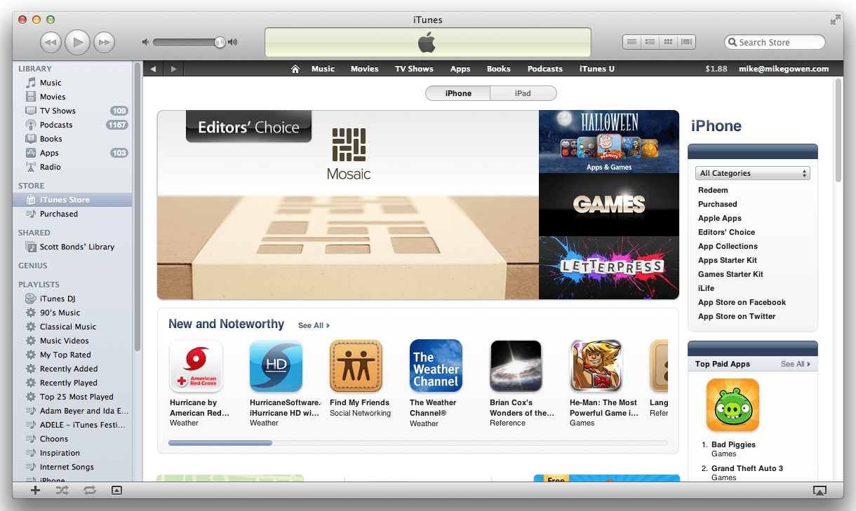
Featured by Apple and covered across design and technology press
Mosaic earned an App Store feature alongside coverage from TechCrunch, The Verge, 9to5Mac, Uncrate, and the Today Show.
Finished product
The product as it shipped
Outcome
What Mosaic proved, and what it could not solve
Mosaic launched as a complete product, earned an App Store feature and national press, and remained in operation when the original team left. People could turn 20 photographs into a finished book in about five minutes, just as we had intended.
Building it showed us how important direct customer feedback could be, but the tools for collecting enough of it were painfully cumbersome. That unresolved problem became the starting point for Delighted.
The simplest products are often the hardest to execute because every decision has to count.